My Measurements (Contextual Reviews)
My Role: Creative Direction, UX Design, Graphic Design
My first big project at ModCloth was to revamp the Reviews section. I added in customer measurements and photos. The best part of this project was how much I believed in this concept – to be one of the creators was so exciting, and is something that I'm proud of to this day.
The original Reviews section had a 5-star rating, and allowed the customer to write about the product. This worked well for items with only a few reviews, but was otherwise cumbersome for the customer. The new system introduced a couple of descriptive rankings (Fit, Length, Quality) to help the customer visually see at a glance these important pieces of info.
We also introduced the "My Measurements" feature, providing additional context for interpreting a review. By adding the optional measurements box in the review, a customer could think about the reviewer's body, and how the garment might work on their own unique shape.
In order for this feature to really work, customers would need to be educated on the same system of measuring, so everyone would be measuring the same way. I researched best practices the company was currently using, as well as researched externally to come up with a new system. To announce the launch of the feature, informational postcards and measuring tapes were included in customers' orders.
Reviews section – updated to include Fit/Length/Quality, MyMeasurements, and user-uploaded photos
Pop-up modal to Leave a Review:
Customers could choose to include any or all of their Measurements, or keep their info private if preferred
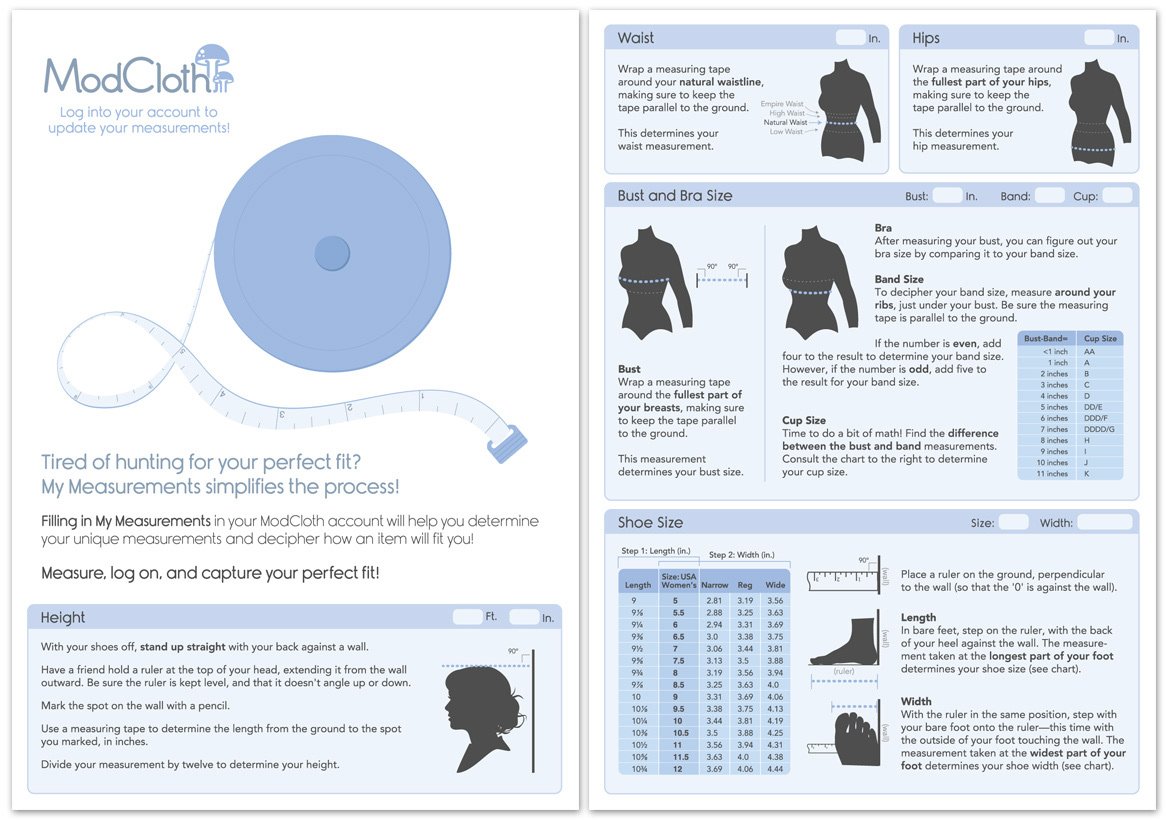
Instructions for how to measure
Marketing Announcement
All orders received a free postcard with measuring tape. This included instructions for how to measure accurately with spaces to quickly write your information.
Printed postcard: a measuring tape was laminated to the front
Postcard design: front and back
Results:
2010: Reviews updated with Fit and Length context, user photos, and My Measurements
2013: The website had reviews for over 80% of products, with 55% of those reviews including detailed customer measurements. My full vision was brought to fruition (after my tenure) with the launch of Fit For Me.
2017: My UX design for Reviews and My Measurements remained unchanged until 2017
Today: My illustrations are still used to explain how to measure


