Walmart: Major Homepage Redesign
My Role: UX Lead, Design and Direction
UX Designer: Carina Velasquez
UX Researcher: Pauline Kilijian
UX Sponsor: Sean Ritzie
*Please note, all content on this page is confidential and should not be distributed. It is shown as an example of my work and thoughts for my personal design portfolio.*
——————
As UX Lead on the Walmart.com Homepage and Global Nav track, I worked closely with the VP of Creative (the page owner, as content tied in very closely with brand and marketing needs). After months of iterative testing of modules and components on the current page layout, I was given the green light to try a major overhaul of the page. The design was somewhat of a “vision” (some requirements on the tech side were needed to make it happen), but could be scaled back and built to spec.
My goal was to bridge digital and physical—customers see “Walmart” as one brand, regardless if it’s a site or store experience they’re after. A vast majority of Walmart shoppers are store shoppers, whereas the growth in digital shoppers was small and failing to meet projections. My hypothesis was that if we could better serve store shoppers online and help them understand how digital could have a positive impact on their lives, we might build a stronger customer base on the website.
The Homepage design utilized personalization and relevancy—layouts, modules and content would change based upon the visitor’s needs.
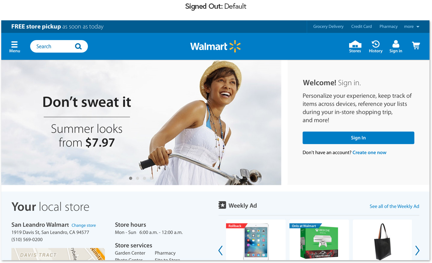
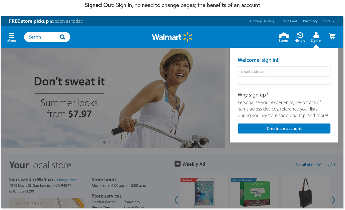
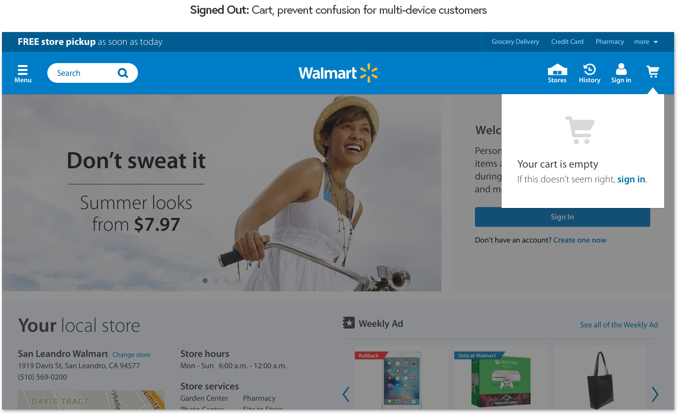
Signed-out state: for brand new visitors...
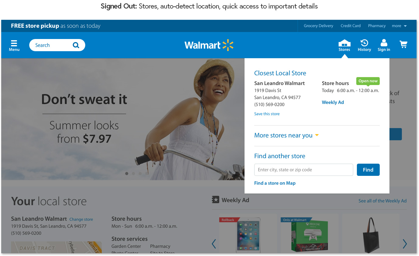
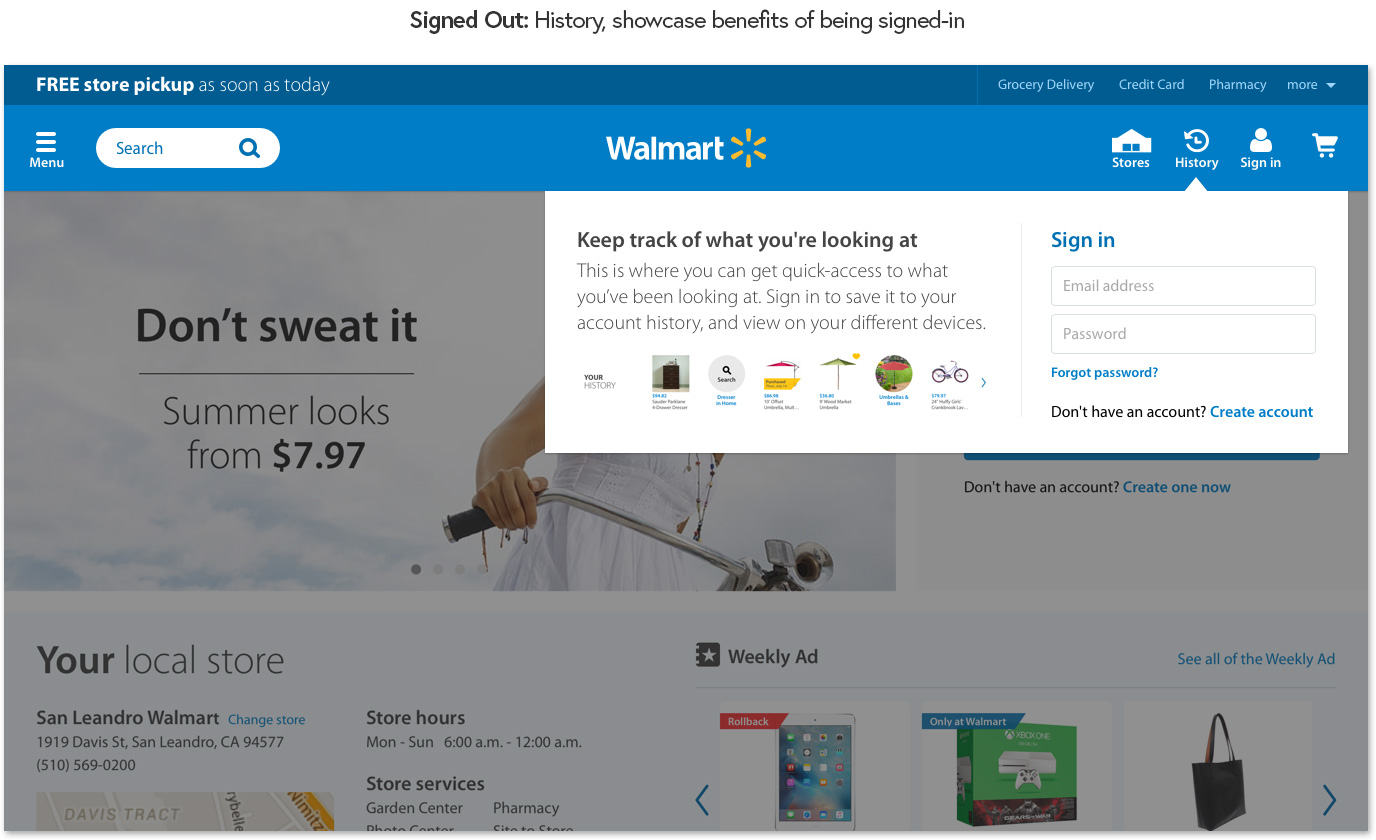
Auto-detecting location to offer relevant store details and promotions, encouraging sign-in by showcasing the benefits of the digital experience throughout the page.

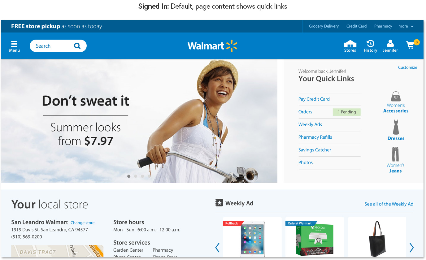
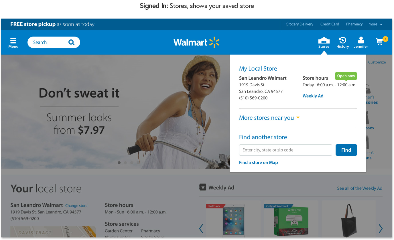
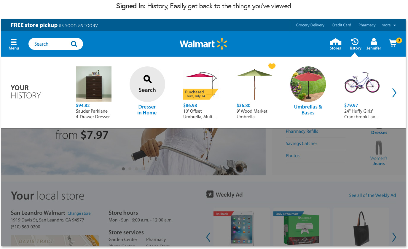
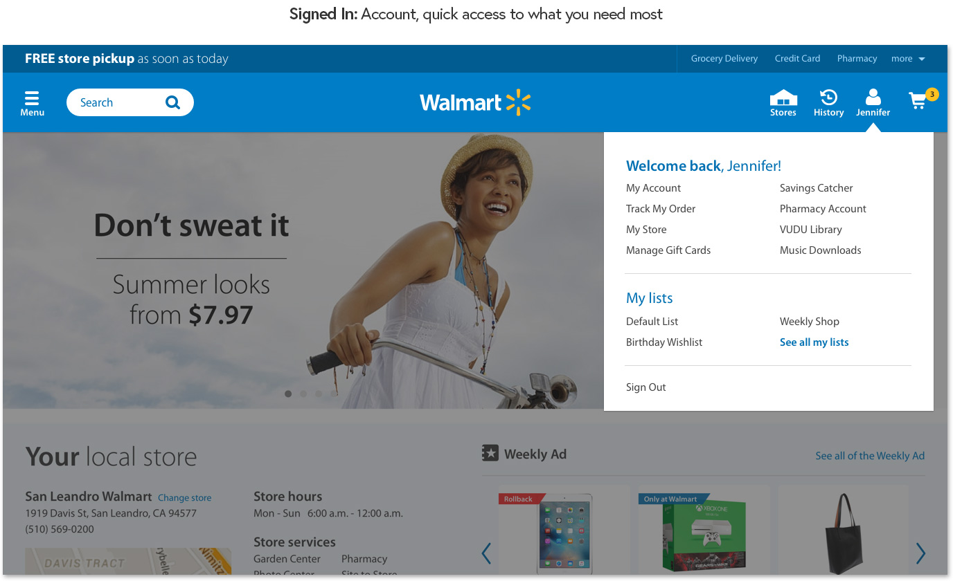
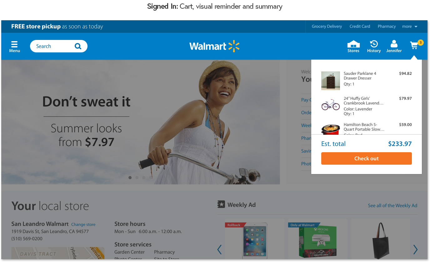
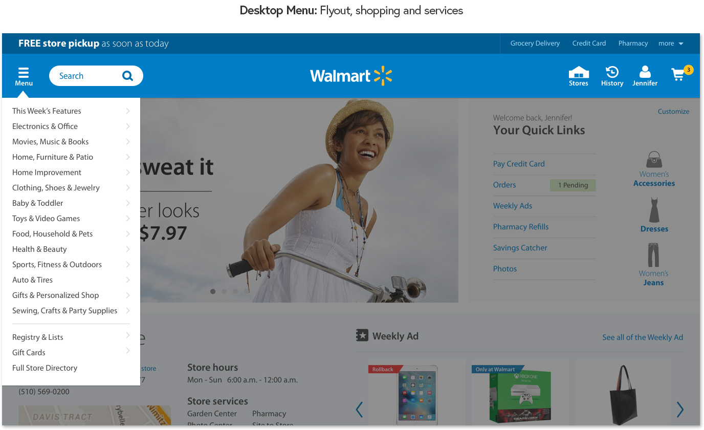
Signed-in state: fully personalized with direct access to previous transactions and account details...
Quick access to store details and site features the customer uses most frequently, placements throughout the page for picking up where they left off.

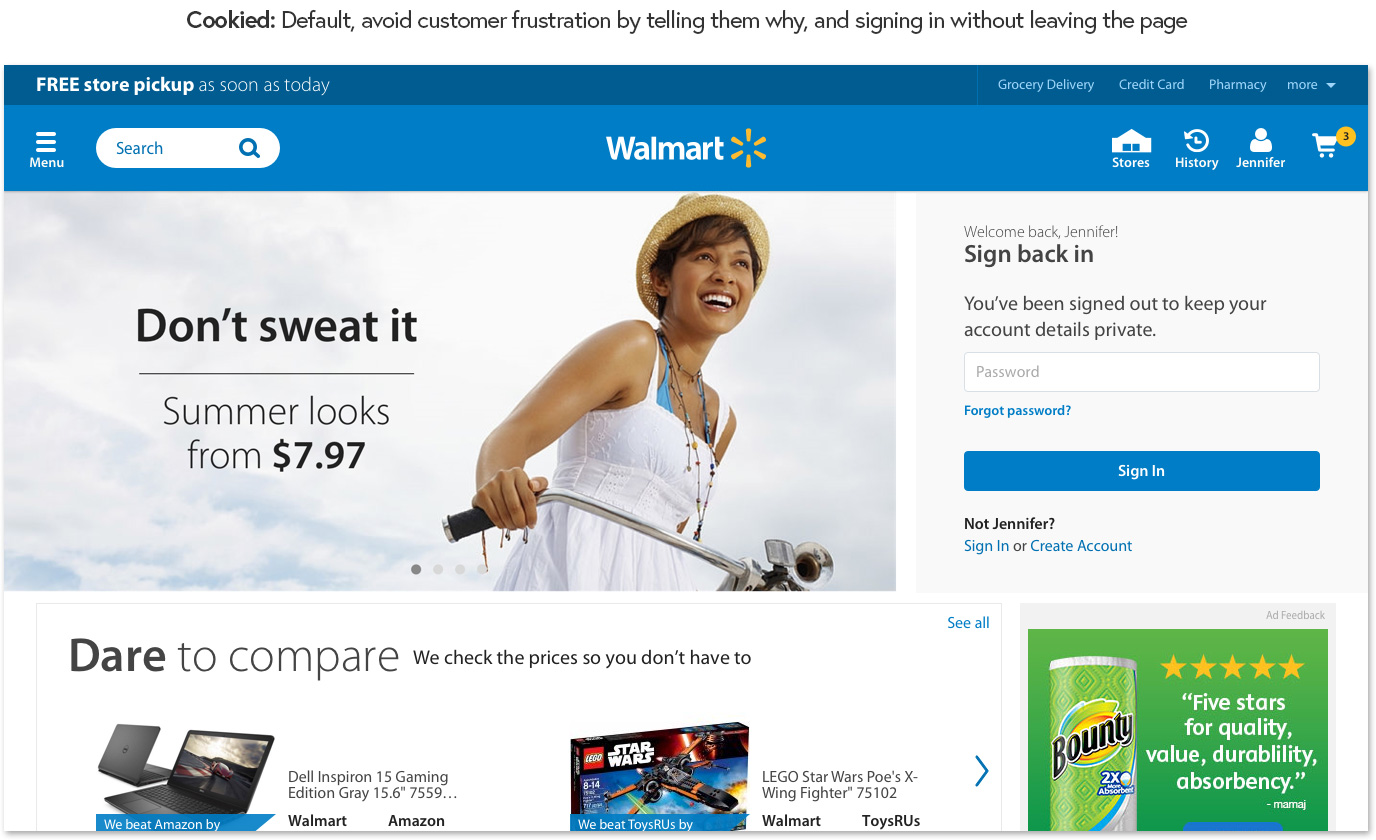
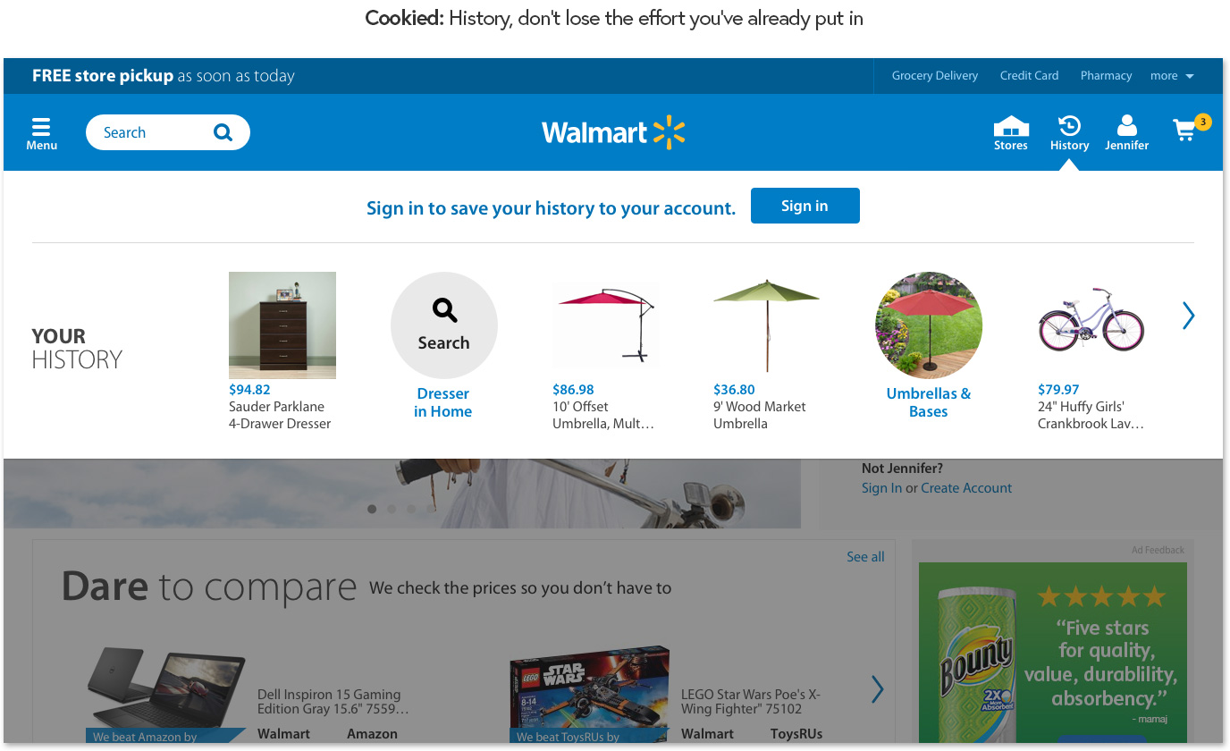
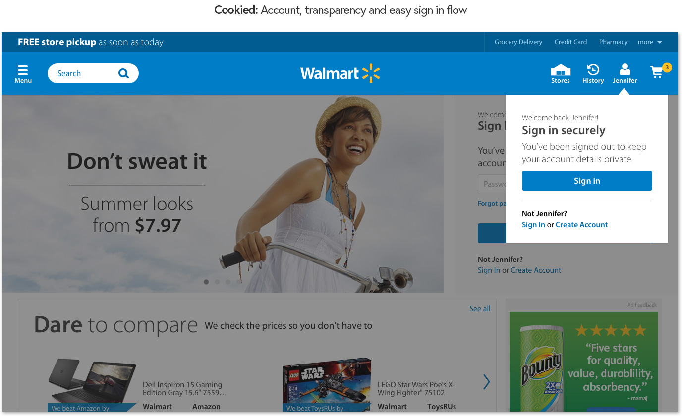
Cookied: scaled-back version of the signed-in page...
Transactional details and are not displayed and remain secure, and https allows customers to sign-in without leaving the page.

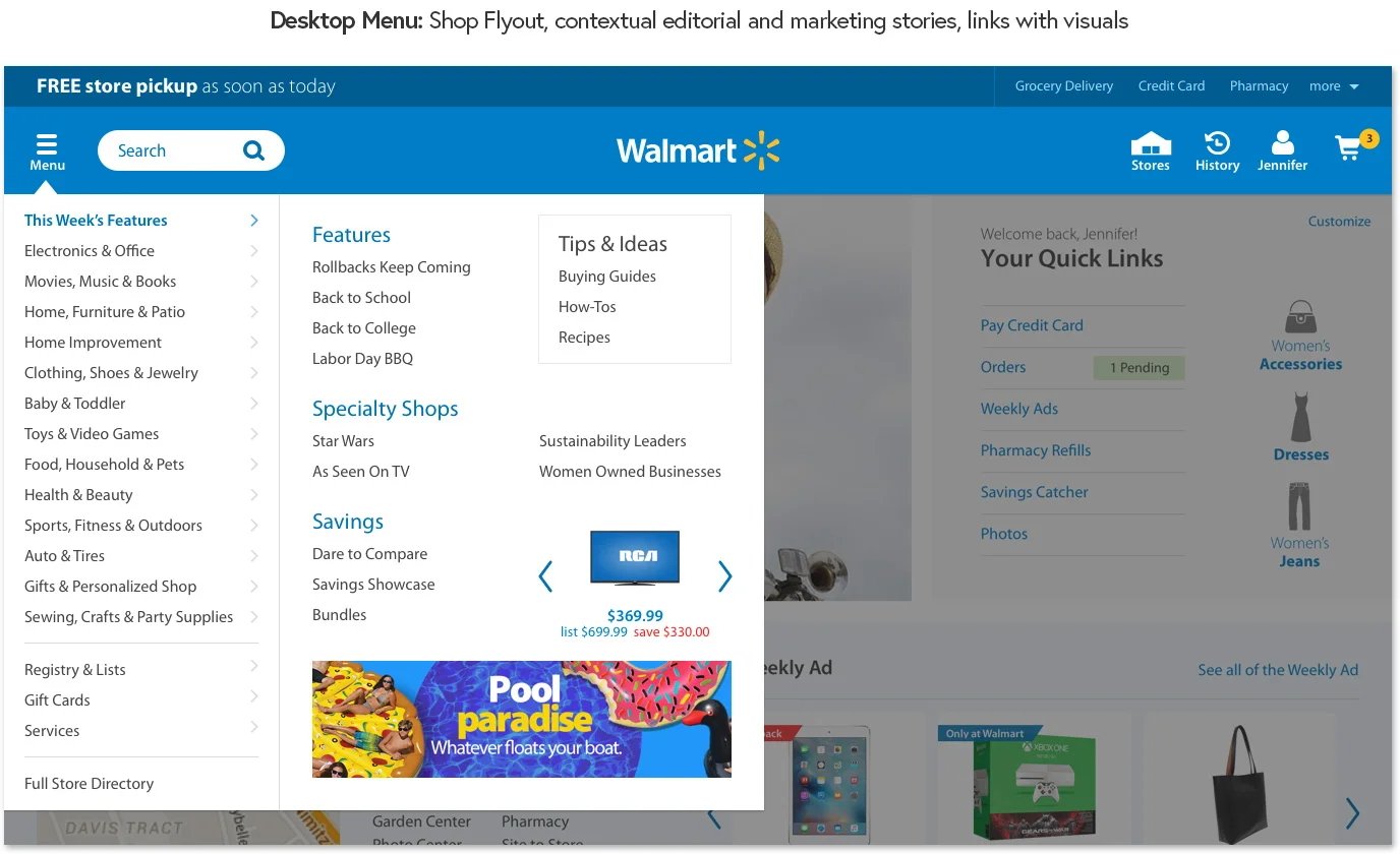
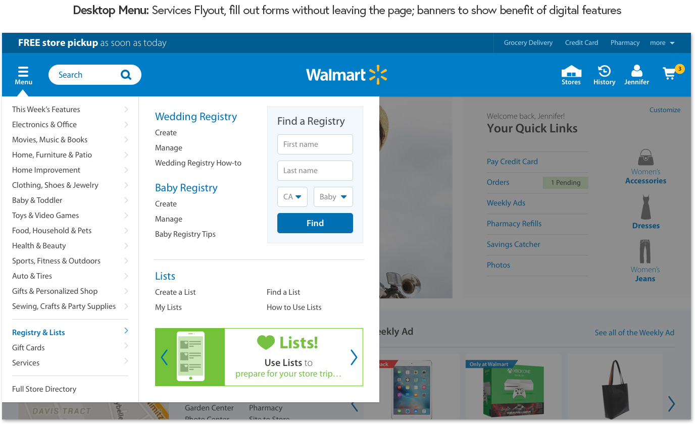
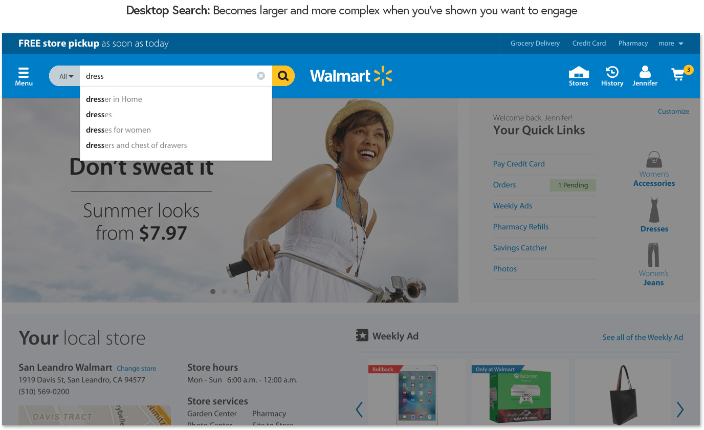
The Header and flyouts reflected signed-in in states...
The Footer included benefits of digital engagement...

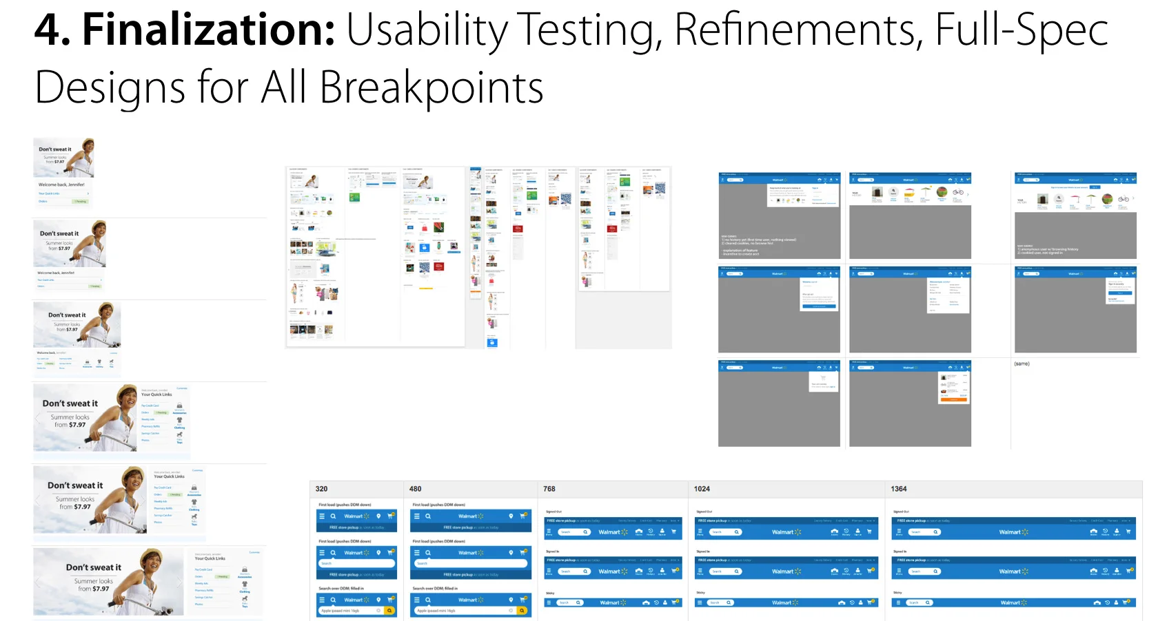
The work was done over two months, broken into two week design sprints...
For a closer look, see my final Keynote stakeholder presentation in this pdf.
For reference, original Homepage:


