Rothy’s: Efficiently Creating a New Campaign
My Role: Direction, Designer (Web Design)
Marketing Designer: Ashlee Rice
Social Media Manager: Lacey Young
Rothy’s had done small partner collaborations with brands in the past, but they had never done a large campaign on their site, so this was new territory. The campaign was a partnership with Breast Cancer Prevention Partners, where the proceeds of all Rothy’s pink shoes sold would be donated to the non-profit. I needed to figure out how to integrate the campaign into the e-commerce website, bringing awareness to customers who landed organically on the site as well as customers who landed via marketing communications. I was going to create a new landing page to fully describe what the campaign was about, and dove right in with the intention of making a new template that could be reused down the road.
I was given minimal content to work with, and knew I needed to dig deeper to create something meaningful. I looked at the partner’s website, really trying to understand their efforts and the passion behind why they do what they do. I read their About pages, bios of their employees, press releases, and watched videos of their employees and partners speaking from the heart. I took copious notes, capturing details that I thought would resonate with our customers.
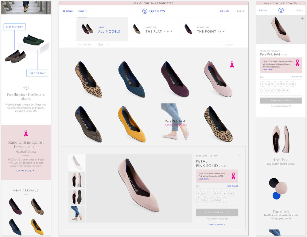
When it came to planning, I plotted out the placements available, and thought about what could be built once with minimal effort and reused later in future campaigns—a simple banner swap at the top of the site header, adding a new banner into the body of the Homepage appearing in a place that did not hinder the other purposes of the page, special call-outs on the promoted shoes, and of course a landing page where customers could get all the details.
Simple pink placements added throughout the website to promote the campaign...

When I started designing the landing page I looked at what currently existed, knowing this would save engineering time to re-use modules. I was able to pull from the newly redesigned Homepage knowing those new styles would be continued, and a new landing page that had been coded but hadn’t yet launched.
Existing designs served as templates, and the code was already done...
I plotted out how to tell a compelling story as the customer scrolled down the page, and I searched for license-free photography to help the page come to life. I designed for the largest and smallest website breakpoints, knowing that some of the modules had already been coded responsively, and I could work with engineers to finesse the details of anything that looked incorrect. My goal for the page was to build a hierarchy of engagement—starting with the campaign offer; offering a quick link to shop for those who didn’t need more information; explaining who the partner is, what they do, and why it matters to the real people that work there; offering ways to get involved, leading with taking action with the partner rather than links for shopping; and ending with the lightweight action of sharing the page with friends, which is an easy way to get involved simply by spreading the word.
The landing page detailed the story of the campaign, and served as a template for future projects...

Once this site work was done and handed off to engineering, the marketing and social media designers pulled from my files to create a story that was cohesive, and supplemental to the elements on the site. Online influencers were commissioned to create supplemental content as well as spread the word with their communities. Customers wrote us sharing their personal stories, and a few touching ones were shared with our followers on social media. The communications with the customers continued with a final recap of how much money was donated, and a thank you to the people who participated.


